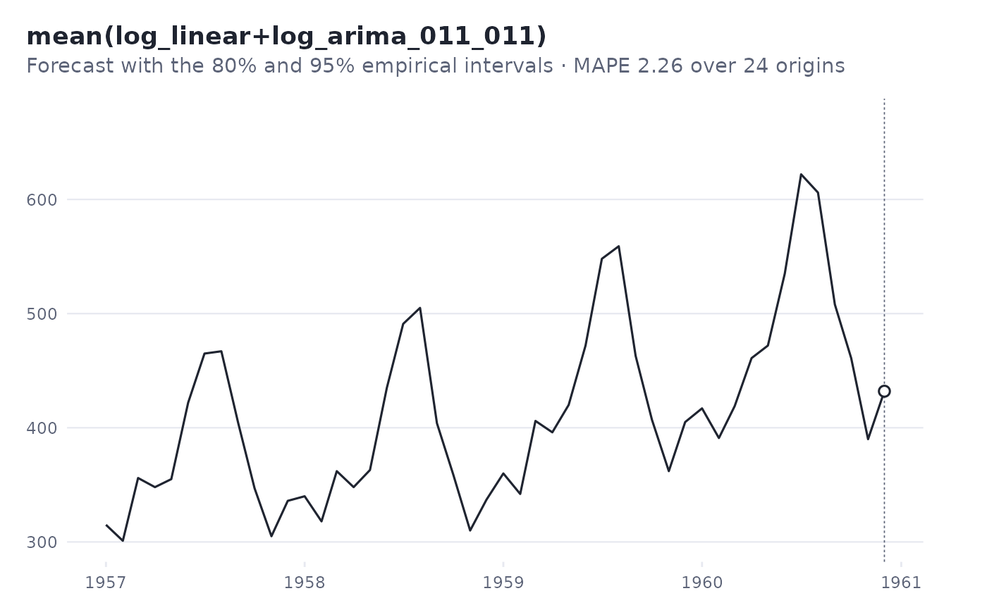
autoplot() draws, with ggplot2:
Usage
# S3 method for class 'foresight_backtest'
autoplot(
  object,
  type = c("forecast", "accuracy", "ranking"),
  candidate = object$best,
  history = 48,
  top = 4,
  ...
)

# S3 method for class 'foresight_backtest'
plot(
  x,
  type = c("forecast", "accuracy", "ranking"),
  candidate = x$best,
  history = 48,
  top = 4,
  ...
)

# S3 method for class 'foresight_decomposition'
autoplot(object, ...)

# S3 method for class 'foresight_decomposition'
plot(x, ...)
Arguments
- object, x
A result of
backtest()or ofdecompose_stl()/decompose_mstl().- type
What to draw.
- candidate
A candidate name, for
type = "forecast"; by default the chosen one.- history
How many of the last observations to show.
- top
How many of the best candidates, for
type = "accuracy": at most 4, so that they can be told apart.- ...
Not used.
Details
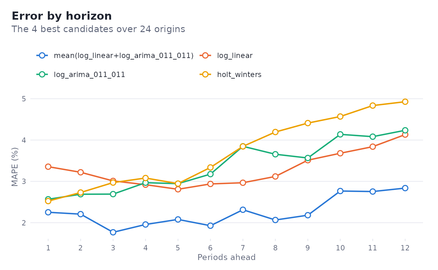
type = "forecast": the last observations and the forecast of a candidate with its empirical intervals;type = "accuracy": the error of the best candidates by horizon;type = "ranking": every candidate by its score, the chosen one highlighted;
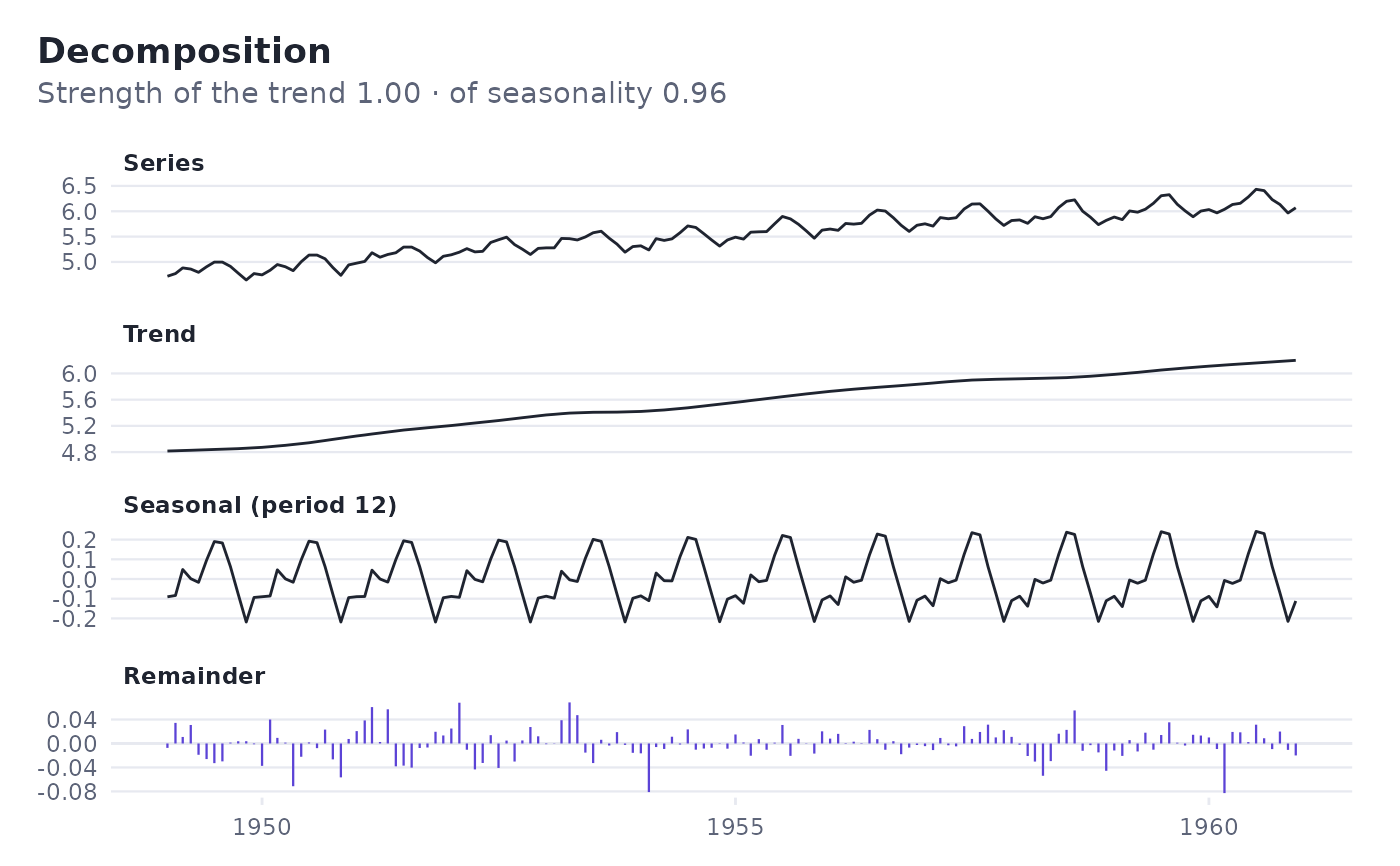
and, for a decomposition, the series, the trend, each seasonal pattern and
the remainder. plot() draws the same chart. Both return a ggplot object,
which can be themed and annotated further.
Examples
bt <- backtest(AirPassengers, origins = 24)
autoplot(bt)
#> Warning: Removed 12 rows containing missing values or values outside the scale range
#> (`geom_line()`).
#> `geom_line()`: Each group consists of only one observation.
#> ℹ Do you need to adjust the group aesthetic?
 autoplot(bt, "accuracy")
 autoplot(decompose_stl(log(AirPassengers), seasonal_window = 13))